1950
|
|
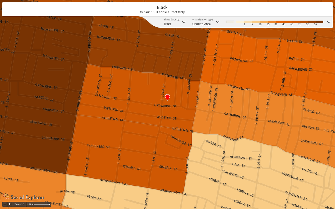
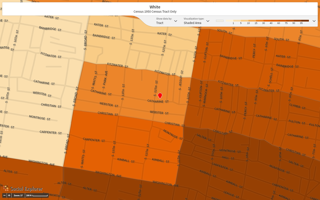
The above maps show the racial composition of Hawthorne and the surrounding neighborhoods according to the 1950 census. This snapshot represents the ethnographic trends which largely characterized the area through the first half of the 20th Century. As the maps indicate, the areas west of Broad and north of Fitzwater have historically been predominantly African American, while east of Broad, particularly south of Washington were mostly white. Hawthorne falls right between these historical trends. The 1950 Census shows that the tract encompassing the current location of Palumbo (indicated by the red pin) was then 75% Black, 25% White.
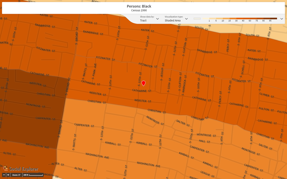
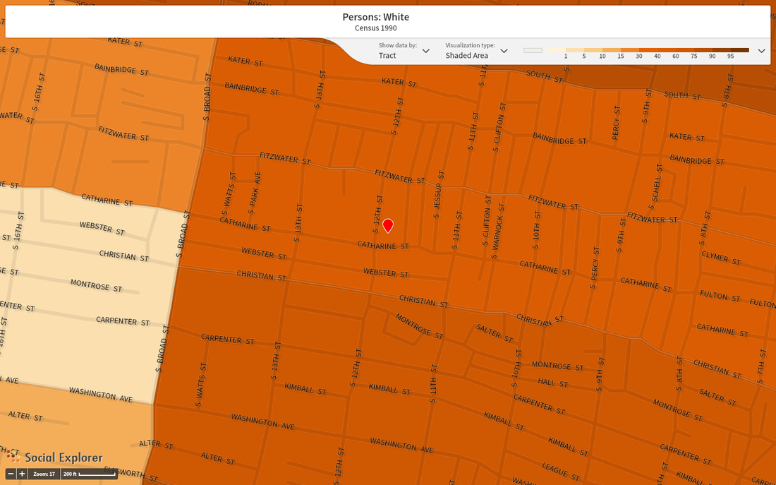
More recent trends, however, show a rapidly changing composition:
More recent trends, however, show a rapidly changing composition:
1990
|
|
2000
|
|
2010
|
|
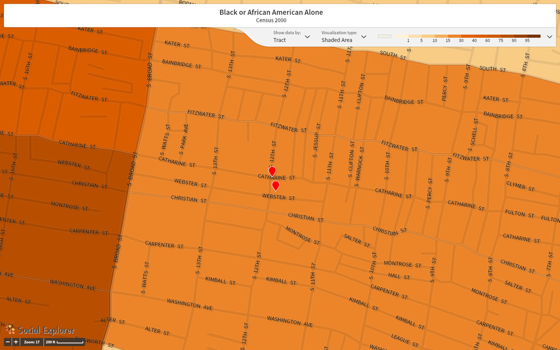
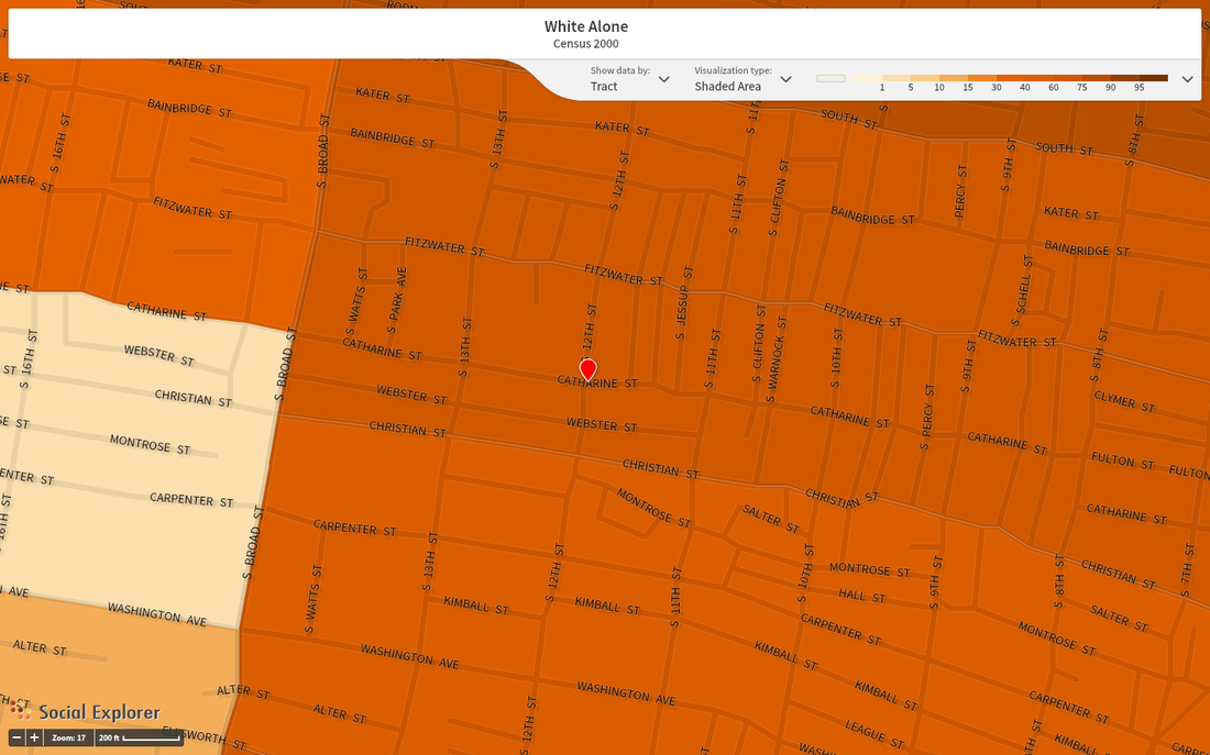
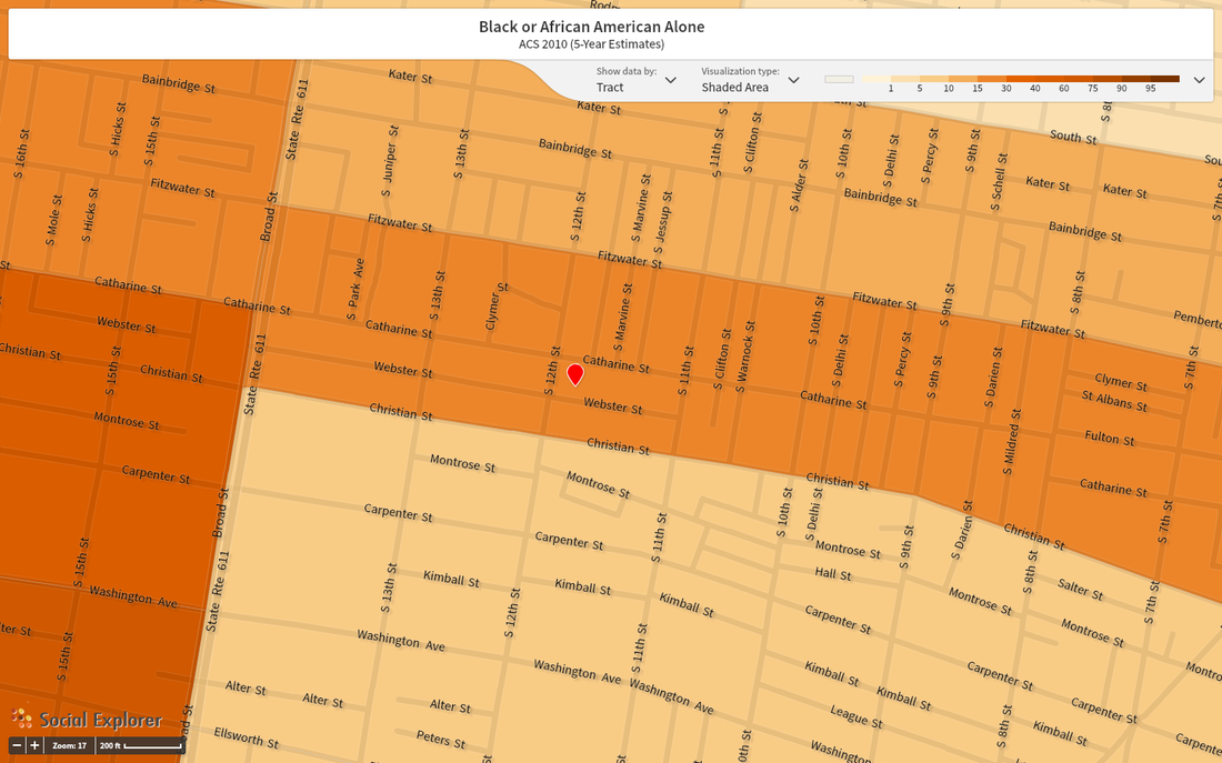
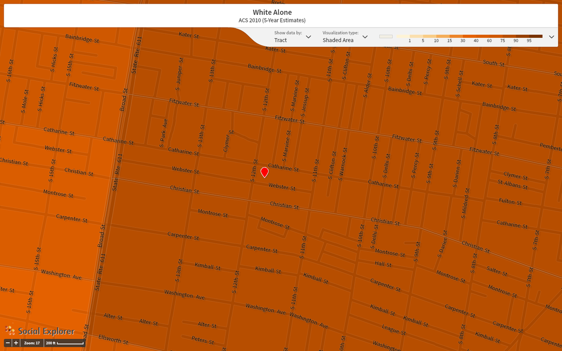
The trend over the last two decades alone is pretty striking. Not only in Hawthorne, but in the entire area east of Broad, the white proportion of the total population of each census tract has rapidly grown since 1990.
As a neighborhood "caught between" the historical racial trends illustrated by the 1950 census, Hawthorne in particular has experienced especially dramatic changes in racial composition over the last half-century.
As a neighborhood "caught between" the historical racial trends illustrated by the 1950 census, Hawthorne in particular has experienced especially dramatic changes in racial composition over the last half-century.
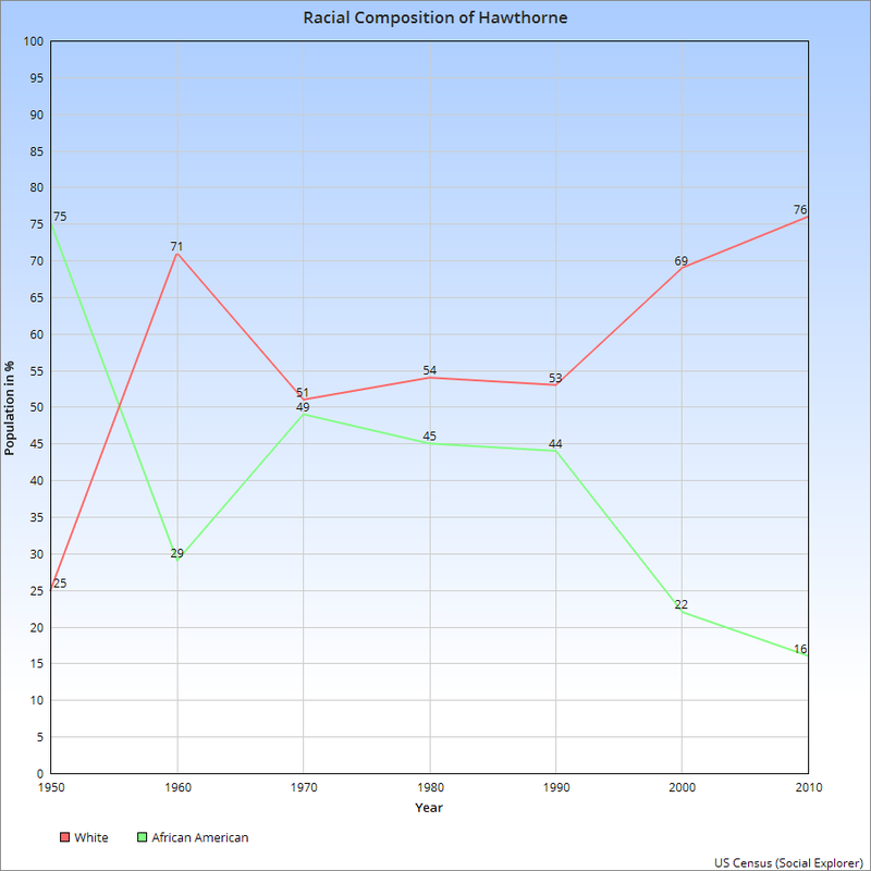
The above chart graphs the white and black proportions of population in Hawthorne recorded in each US Census since 1950. The most striking feature of this graph is the enormous change demonstrated between 1950 and 1960, when there was a 46% swap in population proportion. By the following census, the proportion swung back, resulting in a near-perfect 50-50 composition of the neighborhood. Between 1970 and 1990, this held more or less true, black and white populations not differing by more than 9%, but as the above maps illustrate, the overwhelming trend from 1990 to present has been a rapid increase in the white population.
Before we ascribed qualitative terms to this quantitative data, though, it was important to cross-reference these demographic changes with economic data. Surprisingly, the 1960 and 1970 Censuses did not include Median Household Income, but the data from 1950, and then 1980-2010 are graphed below.
Before we ascribed qualitative terms to this quantitative data, though, it was important to cross-reference these demographic changes with economic data. Surprisingly, the 1960 and 1970 Censuses did not include Median Household Income, but the data from 1950, and then 1980-2010 are graphed below.
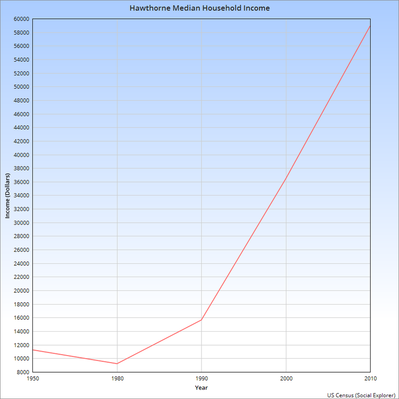
Shockingly, the median household income actually shows a slight net drop between 1950 and 1980. Unless there were dramatic changes lost in the census gap, we might reasonably assume that the neighborhood retained a relatively stable economic identity through the dramatic changes in racial identity from the 1950-1960 period, and the period of stable composition from 1970-1990. Since the increasing white population did not significantly impact the median household income, we might reasonably characterize this period as working-class white families increasingly moving into a historically working-class black neighborhood.
The 70% jump in median household income from 1980 to 1990 seems dramatic, but that's nothing compared to the 277% leap that occurred between 1990 and 2010. In the racial composition graph, 1990 is also a watershed: after 20 years of relative stability, the lines diverge dramatically after 1990. This characterizes this period much differently than the 1950-1990 period. This data is only quantitative, and pretty surface level compared to many of the complex metrics employed by statisticians and professional ethnographers, but the narrative that seems to emerge within this data is one of gentrification.
This project, however, is much more than the data. For more on the stories of the people within this community, continue on to "The Stories," below.
